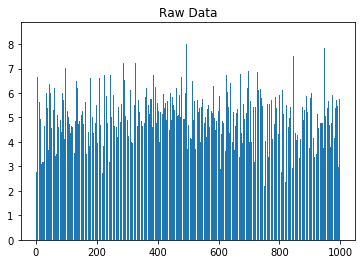
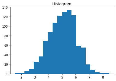
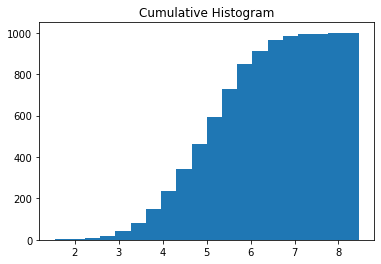
import matplotlib.pyplot as pltimport numpy as np# Use numpy to generate a bunch of random data in a bell curve around 5.n =5+ np.random.randn(1000)m = [m for m inrange(len(n))]plt.bar(m, n)plt.title("Raw Data")plt.show()plt.hist(n, bins=20)plt.title("Histogram")plt.show()plt.hist(n, cumulative=True, bins=20)plt.title("Cumulative Histogram")plt.show()
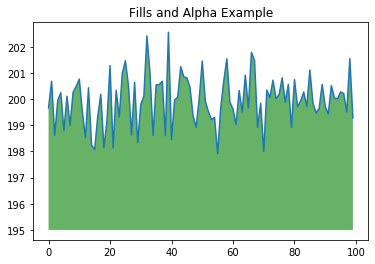
import matplotlib.pyplot as pltimport numpy as npys =200+ np.random.randn(100)x = [x for x inrange(len(ys))]plt.plot(x, ys, '-')plt.fill_between(x, ys, 195, where=(ys >195), facecolor='g', alpha=0.6)plt.title("Fills and Alpha Example")plt.show()
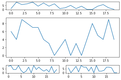
2.1.8 Subplotting using Subplot2grid
import matplotlib.pyplot as pltimport numpy as npdef random_plots(): xs = [] ys = []for i inrange(20): x = i y = np.random.randint(10) xs.append(x) ys.append(y)return xs, ysfig = plt.figure()ax1 = plt.subplot2grid((5, 2), (0, 0), rowspan=1, colspan=2)ax2 = plt.subplot2grid((5, 2), (1, 0), rowspan=3, colspan=2)ax3 = plt.subplot2grid((5, 2), (4, 0), rowspan=1, colspan=1)ax4 = plt.subplot2grid((5, 2), (4, 1), rowspan=1, colspan=1)x, y = random_plots()ax1.plot(x, y)x, y = random_plots()ax2.plot(x, y)x, y = random_plots()ax3.plot(x, y)x, y = random_plots()ax4.plot(x, y)plt.tight_layout()plt.show()
2.2 Plot styles
Colaboratory charts use Seaborn’s custom styling by default. To customize styling further please see the matplotlib docs.
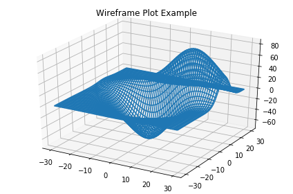
import matplotlib.pyplot as pltfig = plt.figure()ax = fig.add_subplot(111, projection ='3d')x, y, z = axes3d.get_test_data()ax.plot_wireframe(x, y, z, rstride =2, cstride =2)plt.title("Wireframe Plot Example")plt.tight_layout()plt.show()
2.4 Seaborn
There are several libraries layered on top of Matplotlib that you can use in Colab. One that is worth highlighting is Seaborn:
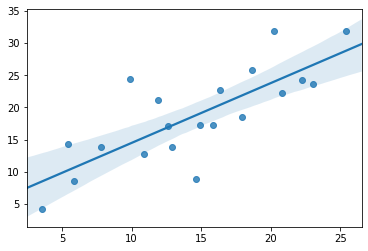
import matplotlib.pyplot as pltimport numpy as npimport seaborn as sns# Generate some random datanum_points =20# x will be 5, 6, 7... but also twiddled randomlyx =5+ np.arange(num_points) + np.random.randn(num_points)# y will be 10, 11, 12... but twiddled even more randomlyy =10+ np.arange(num_points) +5* np.random.randn(num_points)sns.regplot(x, y)plt.show()
That’s a simple scatterplot with a nice regression line fit to it, all with just one call to Seaborn’s regplot.
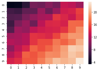
import matplotlib.pyplot as pltimport numpy as np# Make a 10 x 10 heatmap of some random dataside_length =10# Start with a 10 x 10 matrix with values randomized around 5data =5+ np.random.randn(side_length, side_length)# The next two lines make the values larger as we get closer to (9, 9)data += np.arange(side_length)data += np.reshape(np.arange(side_length), (side_length, 1))# Generate the heatmapsns.heatmap(data)plt.show()
2.5 Altair
Altair is a declarative visualization library for creating interactive visualizations in Python, and is installed and enabled in Colab by default.
import numpy as npfrom bokeh.plotting import figure, showfrom bokeh.io import output_notebook# Call once to configure Bokeh to display plots inline in the notebook.output_notebook()
N =4000x = np.random.random(size=N) *100y = np.random.random(size=N) *100radii = np.random.random(size=N) *1.5colors = ["#%02x%02x%02x"% (r, g, 150) for r, g inzip(np.floor(50+2*x).astype(int), np.floor(30+2*y).astype(int))]p = figure()p.circle(x, y, radius=radii, fill_color=colors, fill_alpha=0.6, line_color=None)show(p)